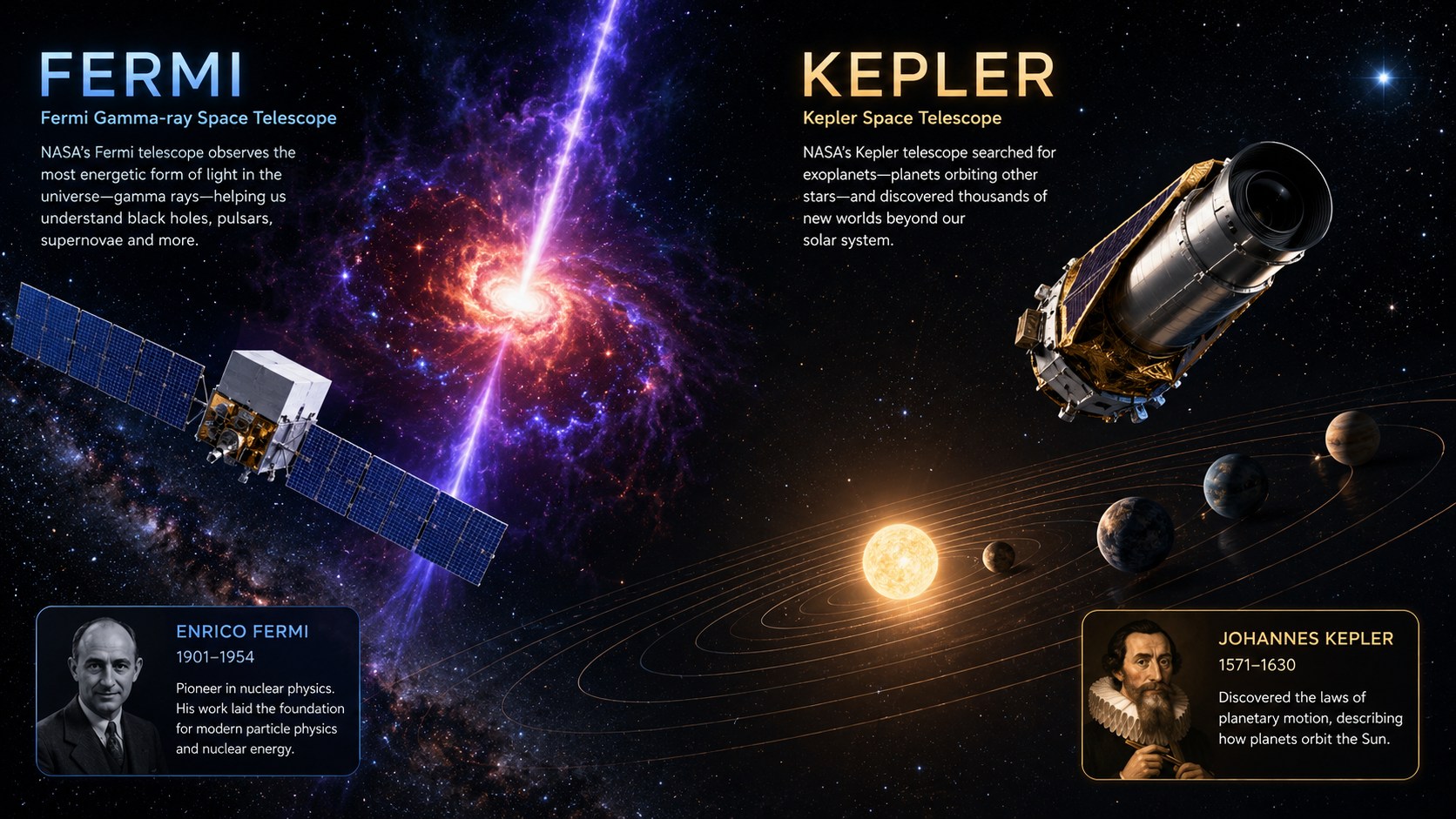
Say Hello to Fermi and Kepler, Our Newest Servers
If you've been with us for a while, you'll know that every server in the proxycheck.io network gets a name pulled from space. Today we're welcoming two more members to that family: Fermi, now serving North America, and Kepler, now serving Europe.
Both names are a nod to two scientists whose work still shapes how we look at the universe, and, fittingly, both have NASA space telescopes named after them too. Here's a bit about where the names come from, and why these particular servers matter more than most.
Meet Fermi
Enrico Fermi (1901–1954) was an Italian physicist whose career touched almost every corner of modern nuclear and particle physics. He won the Nobel Prize in Physics in 1938 for his work on induced radioactivity, and a few years later led the team that built the world's first nuclear reactor, achieving the first self-sustaining nuclear chain reaction in 1942. The class of particles called fermions, and the element fermium, are both named in his honour.
NASA's Fermi Gamma-ray Space Telescope has carried his name into orbit since 2008. It scans the sky for the highest-energy light there is, gamma rays, tracking everything from pulsars and supernova remnants to flares from supermassive black holes.
Our new Fermi server is deployed in North America and features AMD's latest Zen 5 architecture.
Meet Kepler
Johannes Kepler (1571–1630) was a German mathematician and astronomer best known for his three laws of planetary motion, which described, for the first time, how planets actually move around the sun in ellipses rather than perfect circles. Working from the painstaking observational data of his mentor Tycho Brahe, Kepler's laws went on to form much of the foundation Isaac Newton later built his theory of gravity on.
NASA's Kepler Space Telescope carried that legacy forward from 2009 to 2018, staring at a single patch of sky and watching for the tiny brightness dips caused by planets passing in front of their stars. It's responsible for confirming thousands of exoplanets, and for fundamentally changing how we think about the prevalence of other worlds.
Our new Kepler server is deployed in Europe, and also features AMD's latest Zen 5 architecture.
Why these two servers are special
Fermi and Kepler aren't just new additions, they're currently the most powerful servers in our entire fleet, built on AMD's latest Zen 5 architecture with plentiful DDR5 memory and PCIe 4.0 NVMe drives, like all our other server nodes these are bare metal servers, we do not share their resources with any other tenants which guarentees performance and security.
Now we do want to discuss the less than glamorous reason we brought these two servers online now rather than next year when we intended to refresh all our server hardware:
- DRAM and NAND flash storage prices have been climbing noticeably, and the trend doesn't look like it's reversing any time soon.
- Server availability from our datacenter hosts has been drying up fast, with lead times stretching out and stock becoming harder to secure.
Put those together, and the risk became clear: even though we didn't strictly need Fermi and Kepler online today, we could see a real possibility of needing that capacity in 2027 and simply not being able to get our hands on it when the time came. Rather than gamble on availability and pricing one-to-two years from now, we decided to secure our own supply early while we still could.
What this means for you
In practical terms, this means more headroom, more redundancy, and faster responses across North America and Europe as traffic continues to grow. As always, our full server status and locations are visible on our service status page, so you can see all our nodes and their health status.
Thanks for reading and have a wonderful weekend!