![]()
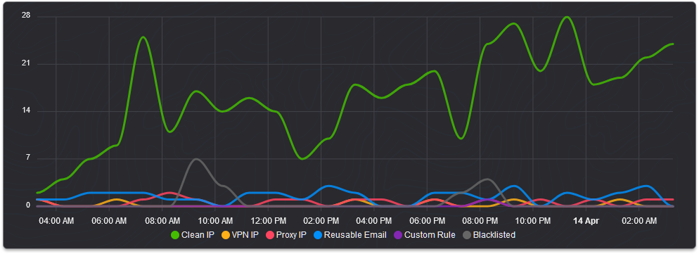
Today we've updated the graphs you'll find within your dashboard's stats tab to further break out the detection types shown to now include blacklisted entries and those triggered by a custom rule.
This change was made based on user feedback and it brings some much-needed consistency to the stats tab as you could previously only see blacklisted and custom rule entries in your positive detection log and active tag list but not in the graphs.
Below is how the new bar graphs look with the added data.

Within the bar graphs, we're also further breaking out blacklisted entries into their own bars for both IP addresses and email addresses. Currently, custom rules are not supported for disposable email checking which is why there's no separate entry for those at this time.
And below is how the new line graph looks, we've also now locked the colors which are used to represent specific data points so they're consistent between loads even if one or more pieces of data are absent.

To have your data populate for these new graphs you'll need to be using the latest version of our API dated the 22nd of January 2024. We've also updated the Dashboard APIs to make this data available there too. We know for some of you this has been a very desired feature and we're happy to oblige as the inconsistency between the graphs and logs had been overlooked for far too long.
Thanks for reading and have a wonderful weekend!