![]()
Today we've launched a redesign of our lookup pages. These new pages feature more information than previously shown in a denser way, with a better layout, new iconography, data accessibility improvements and a focus on the address information that matters most to our customers.
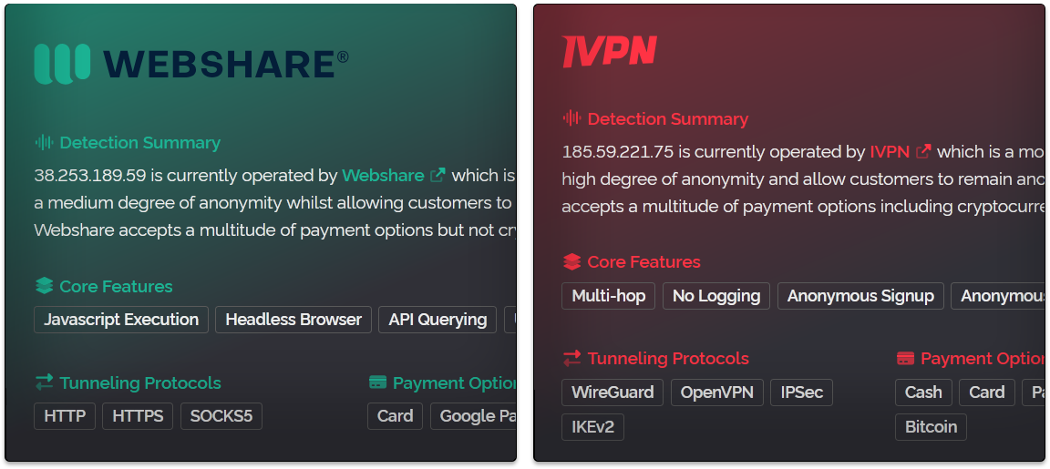
One thing we did a few years ago is we launched operator data on the API and with it we added operator cards to the lookup pages. We really liked the design of these cards and wanted to expand the entire look of the page to match them. That is where today leads us, now all the colors and boxes are uniform to the operator you're looking at. Below is a screenshot showing the new updated operator cards in two brand colors green and red.
In addition to these we now have generic summaries for when we don't have an operator card available and they look like the image below.
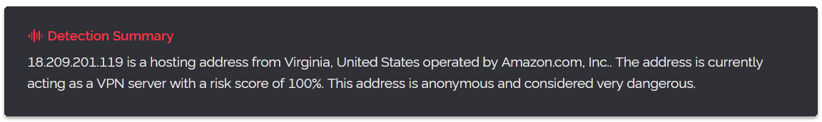
All the label colors you're seeing in these screenshots are based on either the operators brand colors or if one isn't available the type of detection we've made. So you may see red, orange or blue as generic color choices based on detection types, thus not every result will appear in red.
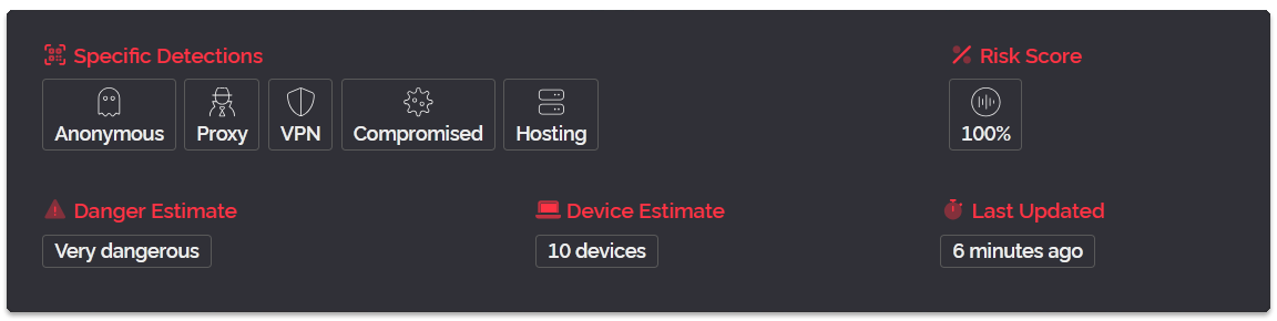
Below the summaries we now have a new detection section like shown below with large icons representing the various detection types. Since this page uses our new v3 API we can display multiple detections simultaneously for the first time and it also means operators of an IP will be much more consistently shown at the top of the pages, something our v2 API struggled with due to how it could only display a single detection type.
One thing we wanted to emphasize on the page is what our customers come to the page for, to check if an IP is anonymous or not. And so we removed the large encompassing map from the top of the page and have instead placed a smaller square for the map on the middle-right location section of the page as shown below. We've also added a new network section to the left, we seperated these two panels visually to make it easier to browse.
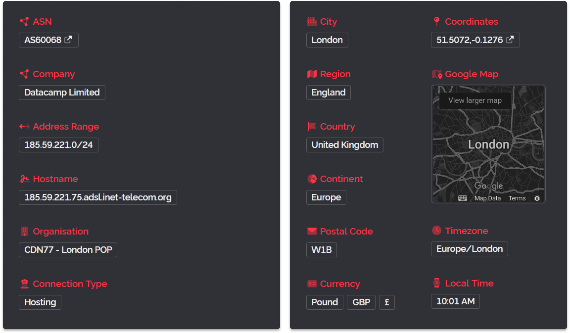
One other change you may notice is we've switched to Google Maps for the embedded map. We feel this is more likely the map brand of choice for our customers and so that's why we switched. Clicking on the Coordinates link or the map itself will take you straight to Google Maps for the location shown.
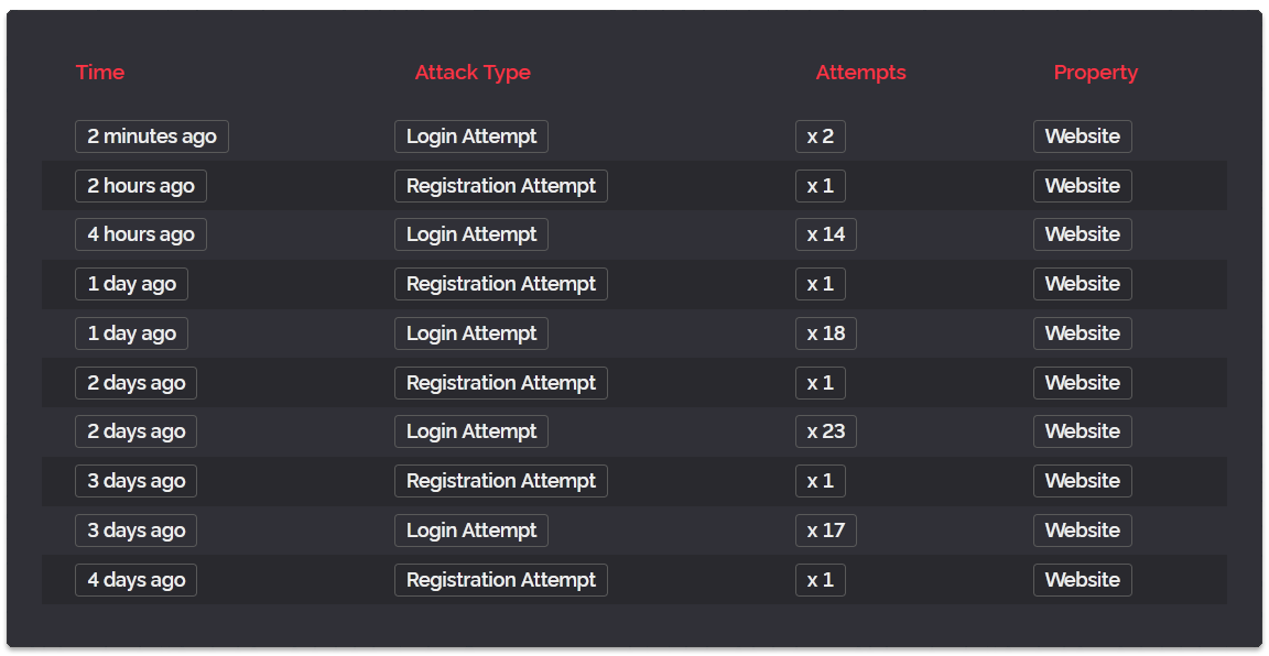
And finally we've redesigned our attack log display as shown below. This feature is something we're going to be refocusing on later as we are considering how to bring this data to the v3 API and as such right now it's an on-page exclusive feature.
One last thing we wanted to discuss is accessibility. We know that a lot of customers use the lookup page to gather information that they then copy and paste into documents, emails and other off-site tools. We wanted to make this easier and so we've added hidden copy-to-clipboard buttons next to every label which reveal themselves on-hover of your mouse cursor for every piece of informaiton shown on the page making it very quick to copy the data you need.
In addition to that we spent a lot of time making sure the page looks nice and works well on small-screened devices like tablets and phones without sacrificing the information density for desktop and laptop users. The previous lookup page was very difficult to use on mobile due to the side-by-side table layout and we've now done away with that for a mobile-friendly vertical grid system instead.
So that's the update for today, if you would like to see a live example of the new pages you can click right here. Thanks for reading and have a wonderful week!