
Today we're launching the first in a series of visualisation improvements for the customer dashboard statistics tab. And specifically, we're starting with the graph of your daily query usage.
There were a few things we wanted to resolve with this redesign.
- Add proper timestamps along the bottom of the graph
- Improve the resolution of the graph so it shows per-minute trends
- Display times and dates in your local timezone
- Make the chart interactive through selectable timescales, resolution and zooming
- Easier to visually understand by switching to line-graphing from filled-graphing
- Better floating toolbar that follows your mouse cursor
So to explain where we've gone with the new chart lets first show you what it looks like displaying the previous 15 days of a test account which is set at a similar precision level to our previous chart which means it's displaying only a single data point per 24 hours of data.
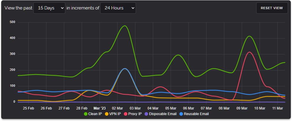
As you can see every day is represented by very large and smooth lines. This is great for an overview but it doesn't show us the trends throughout a single day. That is where the new precision dropdown comes in and if we select to view this data in increments of hours we get a much different view.
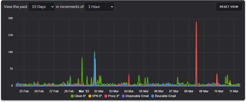
Now we can see where our peaks and valleys are but the data is so precise over the total 15-day time scale that a lot of the information has become crushed down at the bottom. This is where our new zooming feature comes in, you can simply draw a box over a section of the graph and view that area like below.
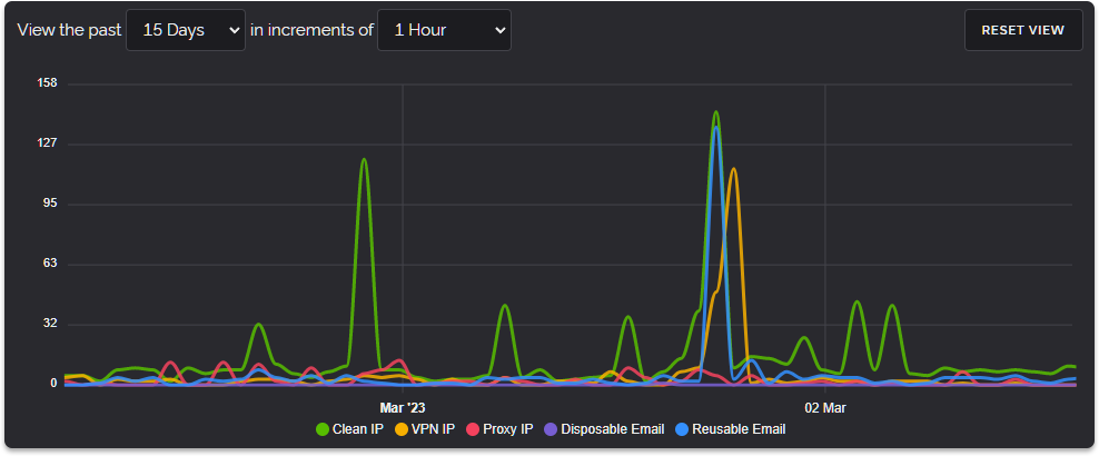
Now we get a better picture of what we're looking at. And all of this happens on the page in real time, in-fact the chart loads incredibly quickly even with very large volumes of data. Below is a gif showing the speed and fidelity while zooming into a single day in the graph.
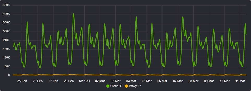
The resolution we're displaying in the above graphs is an hour but as you view smaller increments of time (such as the past hour or past day) you're able to select higher levels of precision right down to viewing per-minute query volumes.
At present we're limiting the past view to 30 days but we may increase this in the future as we're storing each customer's query data for 365 days at a per-minute resolution so it's entirely possible for us to offer 90 days or even more time.
We hope you'll check out the new chart within the Dashboard and let us know what you think. A lot of work went into this feature, especially the next-generation stat recording and storage which drives the per-minute data behind the chart.
Thanks for reading and have a wonderful weekend!