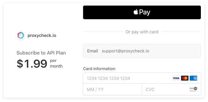
Today we've released a new version of our customer dashboard which spruces up the interface a little bit and adds a more secure way to pay by card and also a new method of paying entirely that doesn't use your card.
So firstly you may notice we've switched up our icons from the previous thin line design to a new dual-tone design which is a bit more modern. We've also made this change to our feature section within our pricing page. We think these new icons look really fantastic, they were done by the FontAwesome.io team of which we are a happy patron.

Secondly maybe not so obvious is we've added some more animations to the dashboard. The invoices section for instance now smoothly slides out as does the positive log filter. We also corrected some inconsistencies with the UI with regards to margins, button animations and styling. These are all very subtle changes that you may not notice but the overall quality improvement will be felt.
We've also had customers tell us that after being subscribed for a long time the invoice section was getting a bit cluttered so we're making some changes there, we're now only showing invoices for your current or most recently held subscription and by default the invoices will be hidden instead of exposed. You can of course always ask support for a past invoice, they're not lost and we always email you a link to your invoices when we charge you, those links will always remain functional.
So let's get to the big change, the new payment gateway. Since we started charging money for our API we have been using Stripe as our payment partner. They've been terrific and we really love using their service. Recently they announced a new version of their checkout product which moves the payment interface from the website you're paying on (proxycheck.io for instance) to Stripes own website.
This has a major advantage in that whilst we always protected your payment information by opening a secure frame to Stripe (and thus we never saw or handled your card information) there was always the chance that the payment page on our own website could be replaced with a malicious one that contains a payment window which looks identical to Stripes and users wouldn't be able to tell the difference.
That is no longer an issue with the new checkout page which is completely hosted on Stripes own website. And it's just as easy as before, you pick the plan you want and click the Subscribe button you're then transferred to Stripe, enter your payment information and then you're transferred back to us for your plan to be processed.
The new checkout also has some enhancements that were not possible on the previous checkout. For example, it supports SCA which is a new secure initiative coming in September where all payments originating within the European Union will require the card owner to authenticate using their mobile device. We welcome this higher level of authentication as it will significantly reduce fraud for both card owners and merchants like ourselves.

But that's not all, with the new checkout we also gain support for new payment methods. As of today we now support Apple Pay which means you can use Safari on your Mac, iPhone or iPad to setup a subscription and in the near future we will also be adding support for Google Pay, Microsoft Pay, iDEAL, Sepa Debit and even more payment methods through the new Stripe hosted checkout page.
So that's all the updates to the Dashboard for today. We still have a lot of things on our roadmap yet to come so keep checking back!